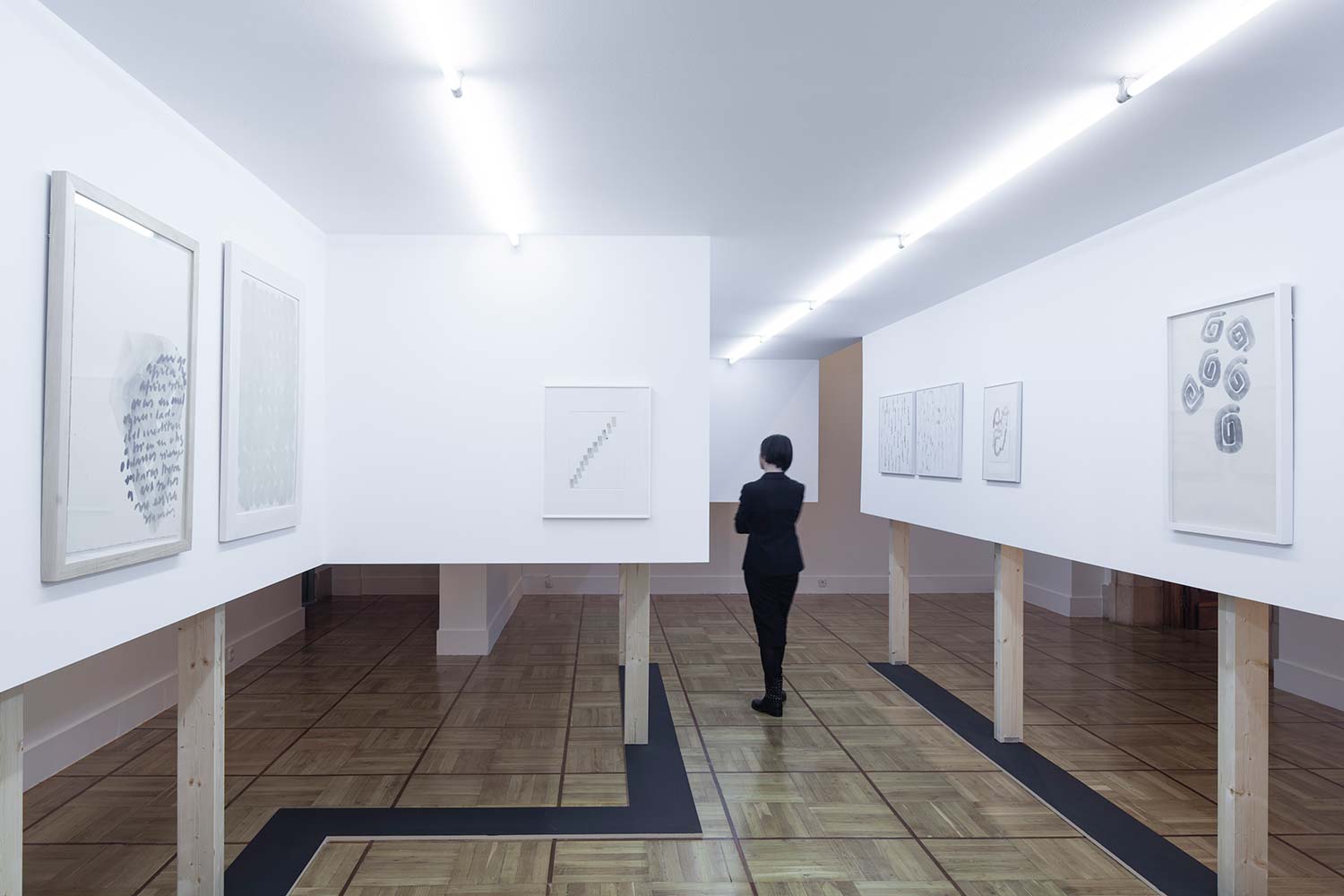


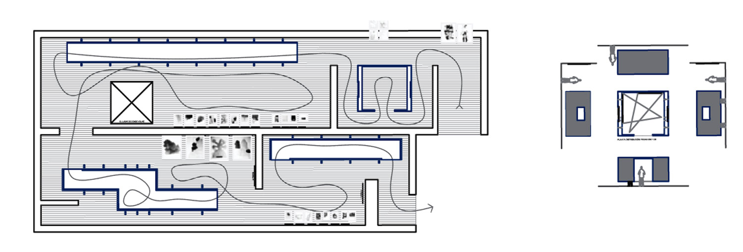
The premises of the project were clear: 4 rooms not very suitable for the work to be exhibited, a lot of graphic material, and the express request of the artist to give character to the exhibition. Finally, the requirement by the museum to carry out the assembly in wood, since the Casa de la Moneda has its own carpentry workshop. In addition to the small-scale work, the exhibition included some medium-scale pieces and a few large-scale and characterful works. The project approach is born from the distinction of these three scales, and the reflection that each scale needs its own space; To this statement, the need to double the exhibition area as much as possible is added due to the large amount of work to be exhibited.
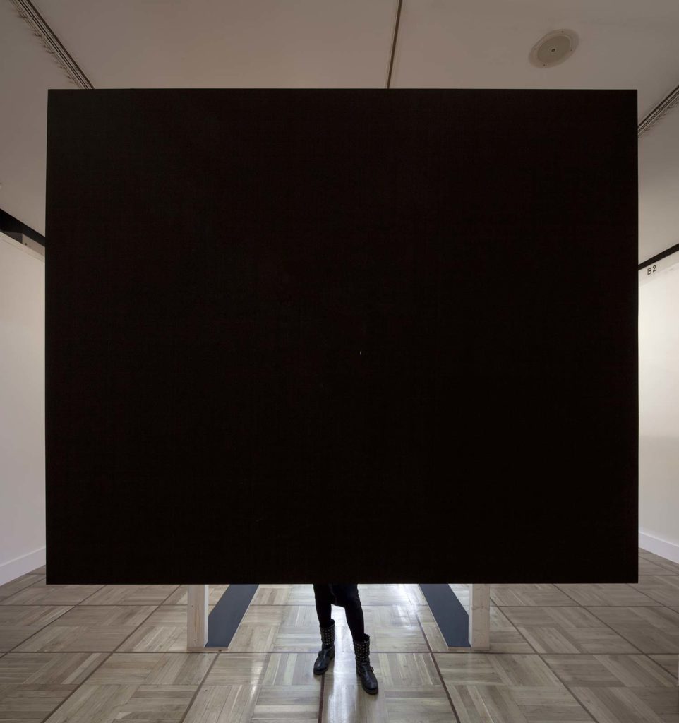
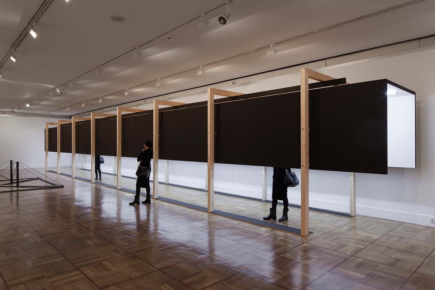
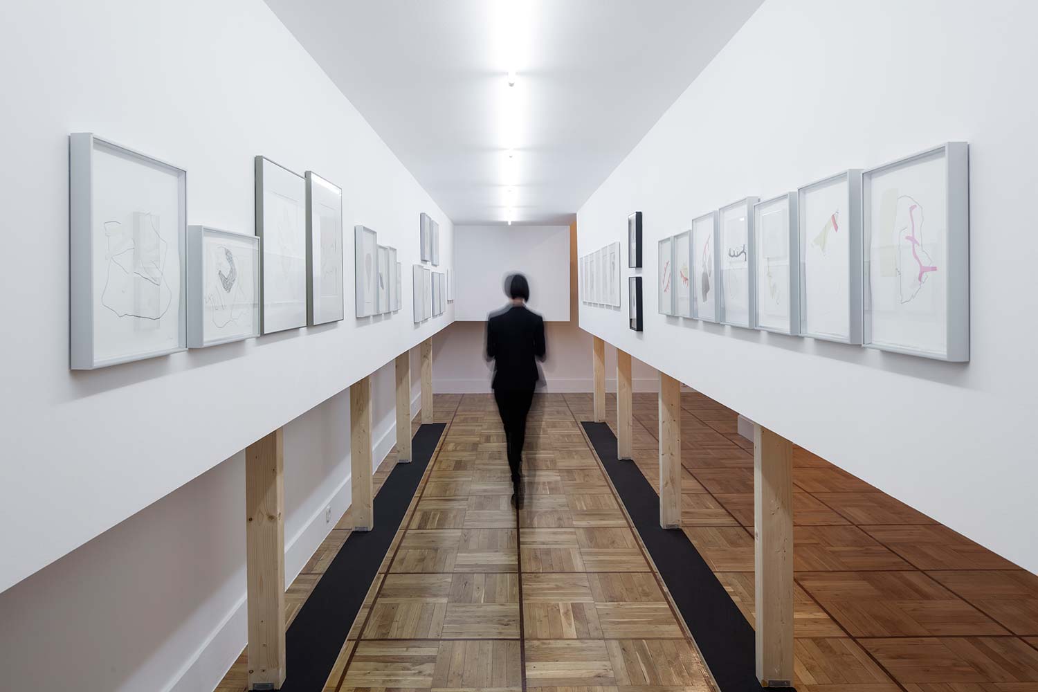
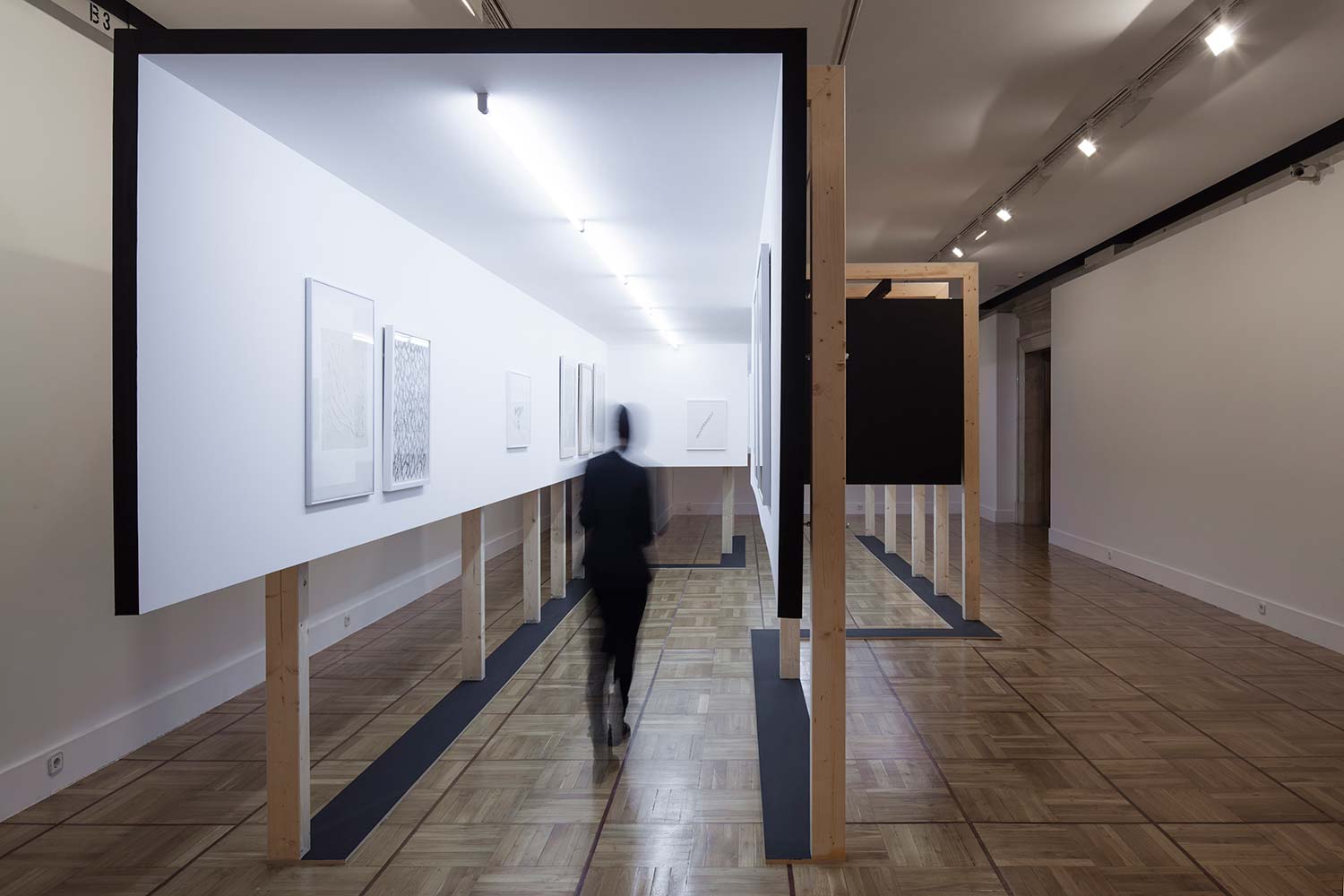
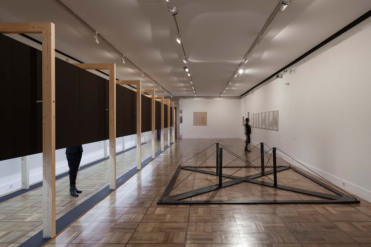
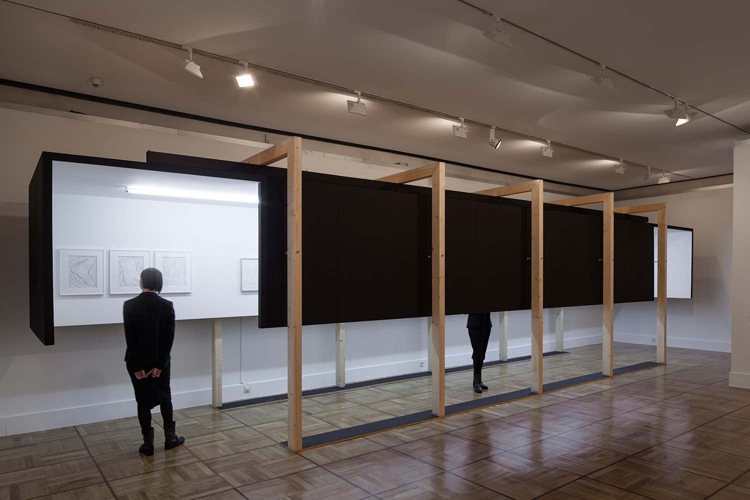
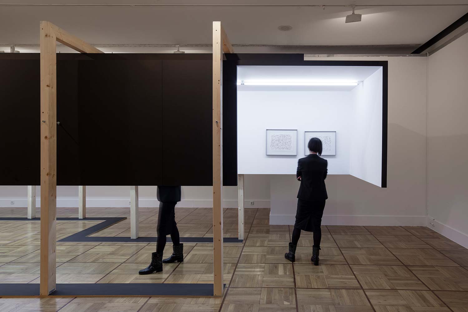
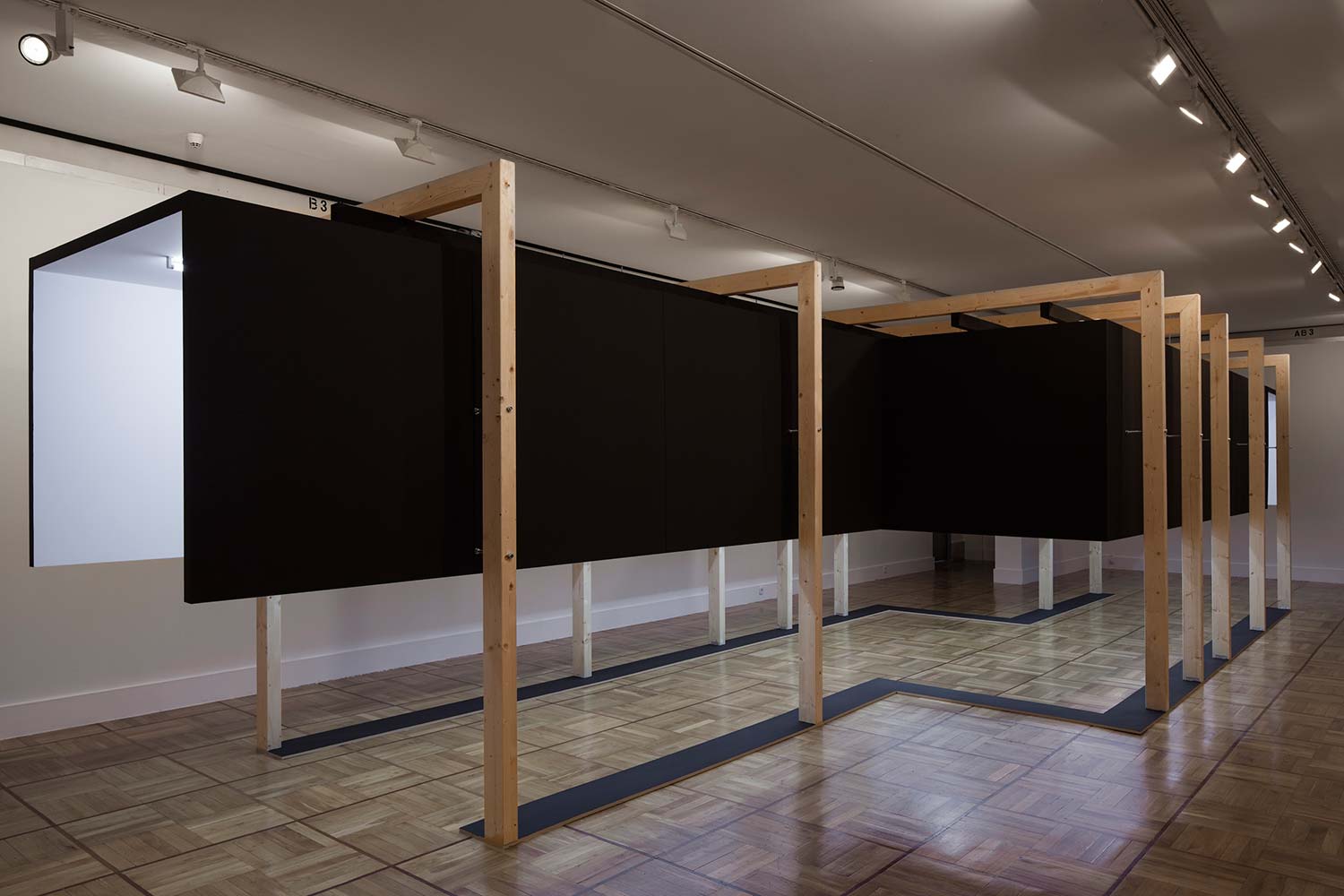
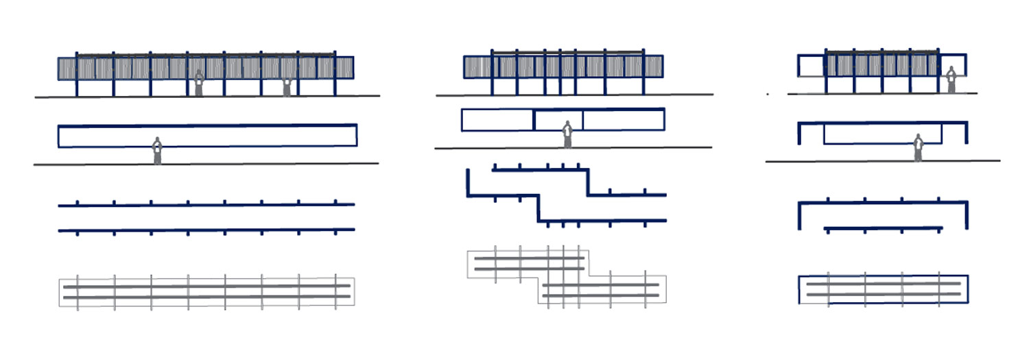
Thus, autonomous bodies are born, which welcome the observer, fostering a more intimate relationship with the small-format work. They are suspended drawers, which reinforce the linearity of the visitor’s journey through their shape; They are finished in white on the inside to give a neutral background to the pictorial work and in black on the outside to strengthen its appearance and continuity. These voluntarily abstract bodies are suspended from a very regular wooden structure that gives them scale and rhythm. From inside these bodies, the relationship with the rest of the room is neutralized; outside these floating boxes partially hide the silhouettes of the visitors who occupy them and create unexpected relationships between the observer, the piece and the exhibition stand.
Thus, each of the 4 rooms contains a certain number of large-format pieces that coexist with a single black contraption that floats in the same room, and that is placed laterally in the space so that these works can be admired without being infected by the diversity of styles, colors or sizes of the smaller works. The abstract nature of each of these bodies does not mean that these devices are not sympathetic to the place where they are located. Its shape, its access to and its proportions respond to the conditions of each of the spaces; In the first room, a very low drawer is located to house the vision of some works in video format; next, and aligned with the access to the second room, an extremely long tube, which in resonance with the curatorial proposal allows to house all the pieces belonging to a specific creative theme; in the third room, the intersection of two dislocated linear tubes, generates a small interior plaza that houses a collection on all its faces; finally in the fourth room is the device itself that leads the visitor to the exit. The routes within the exhibition are random and there is no relevant order other than that marked by the succession of rooms, and the forced linearity of the proposed exhibition elements.
Finally, it is important to highlight the simplicity sought in the construction and appearance of the exhibition stand. The design and assembly of the gadgets exposes the structure, the hardware used, and even the practically industrial lighting of a central fluorescent in each body. Despite their simplicity, these gadgets manage to inhabit the space and provide it with scale and structure. In this way, when the exhibition is visited en masse by schoolchildren, the architecture forces a certain order and criteria to visualize the pieces. On the other hand, when one visits the exhibition alone, which is usual in this place outside school visiting hours, the space does not appear bleak, but rather one feels somehow accompanied and enveloped by the magic of the work of Susana Solano.
